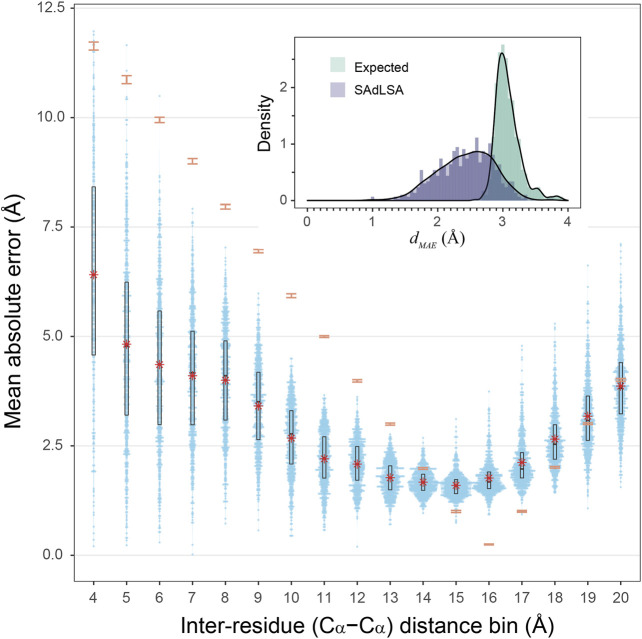
FIGURE 3.
Mean absolute error of predicted distogram vs native distogram for 593 test cases. The main plot displays the distribution of MAE values within each Cα-Cα distance bin from 4 to 20 Å for nonlocal residue pairs. Each bin has a spacing of 1 Å and each blue point represents a target protein. Violin contours are proportional to the counts of targets at different MAE levels with a bin width of 0.025. Black boxes and bars represent the second and third quartiles (25–75% ranked by MAE values) and the median of the distributions. The red stars represent the mean values.comparison, the expected MAE distributions are shown in orange error bars, which are centered at the mean and extended to ±sd. The insert shows the histograms of the d MAE values in two separate assessments, calculated (purple) from the SAdLSA self-alignment and expected (teal) from the background distribution. For each target, its d MAE value is For calculated from all nonlocal residue pairs up to 20 Å as observed in the native distogram.

