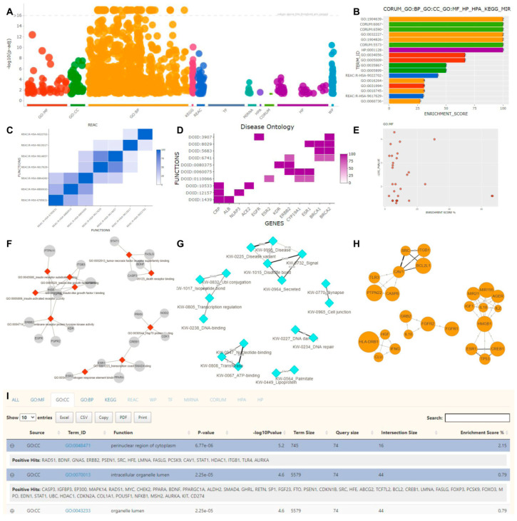
Figure 2.
FLAME’s interactive visualization options. (A) g:Profiler’s result overview in a Manhattan plot. (B) A barchart, incorporating the top 17 results after combining different sources such as GO Biological Process, GO Cellular Component, GO Molecular Function, phenotypes, protein complexes, pathways, and miRNAs. (C) A hierarchically clustered heatmap with pairwise similarities between reactome terms. The color intensity reflects the common genes between each pair. (D) A heatmap showing genes (x-axis) associated with Disease Ontology terms (y-axis). (E) A scatter plot of enriched GO Molecular Function terms. The x-axis represents the enrichment score, while the y-axis the statistical significance. (F) An unweighted network consisting of GO Molecular Function functional terms and their related genes. (G) A weighted network of pairwise UniProt keywords returned by aGOtool. Edge weights are proportional to the number of common genes between each pair. (H) A gene–gene network based on common GOs, where an edge width is proportional to the number of common biological processes (BP) between two genes. (I) An interactive table with enrichment analysis results reported in different tabs (source of the active tab shown: Gene Ontology Cellular Component).

