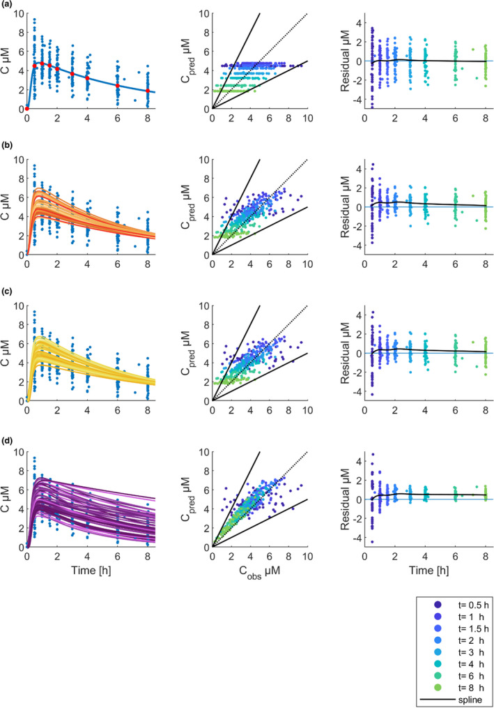
FIGURE 2.

Basic goodness‐of‐fit plots. Rows show the result of the execution of the workflow steps: (a) Base model, (b) Step 1, (c) Step 2, (d) Step 3. Visual predictive check (left column): blue dots show observed caffeine plasma concentrations (C µM), and red dots show the mean of the observed plasma concentrations. The lines display the caffeine physiologically based pharmacokinetic model simulations for the respective cohort of virtual twins. Predicted versus observed concentrations (middle column): dots show the predicted concentrations that were plotted against the observed concentrations. The color of the dots corresponds to the timepoint of the measurement. The dashed black line is the line of unity; solid black lines indicate the twofold range. Residuals versus time (right column): dots show the residuals. The blue line marks the zero line. The black line is a cubic spline through the mean of the residuals
