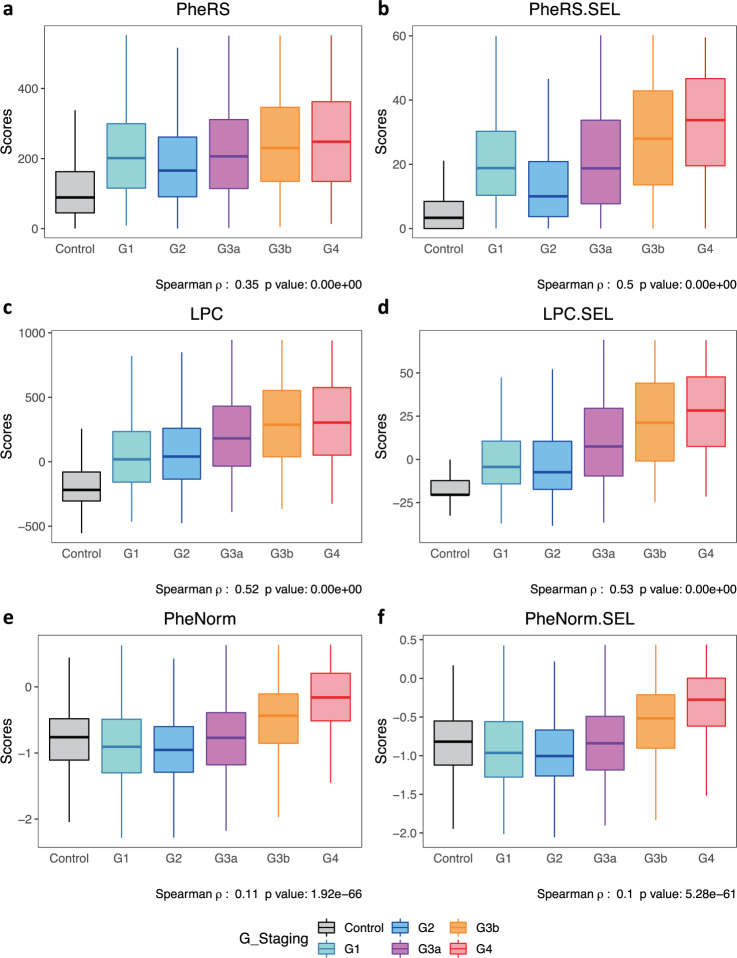
Fig. 2. Quantitative disease risk scores vs. CKD G-staging.
Boxplots of quantitative disease risk scores a PheRS, b PheRS.SEL, c LPC, d LPC.SEL, e PheNorm, and f PheNorm.SEL. Quantitative disease risk scores are derived based on all phecodes (PheRS, LPC, PheNorm), or 110 pre-selected CKD feature phecodes (PheRS.SEL, LPC.SEL, and PheNorm.SEL). The center line, lower and upper bounds of the box represent the median, first quartile (Q1, or 25th percentile), and third quartile (Q3, or 75th percentile) of the data, respectively. The whisker is drawn up (down) to the largest (smallest) observed point from the data that falls within 1.5 times the interquartile range (= Q3 − Q1) above (below) the Q3 (Q1).

