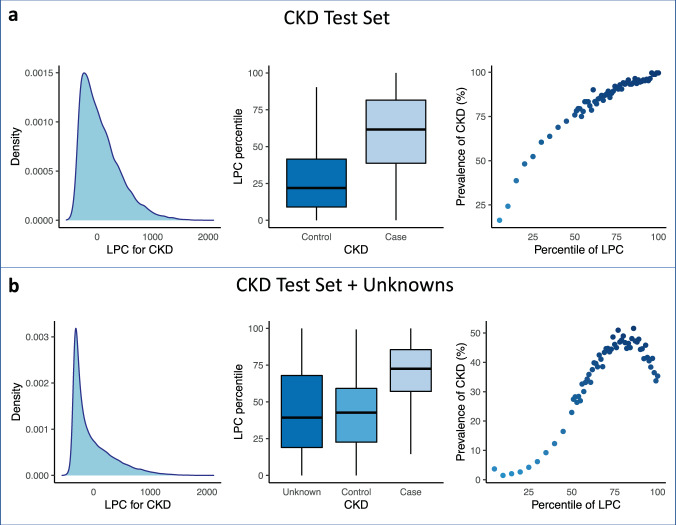
Fig. 4. Distribution of CKD LPC risk scores in the test set vs. test set + individuals with unknown status.
Estimated density and distribution of LPC risk scores cases vs. controls in the a CKD test set and b with unknown status individuals added. LPC risk scores are derived based on all phecodes. Left, distribution of LPC risk scores. Middle, LPC risk score percentiles among cases vs. controls. Right, the prevalence of phenotype in 60 bins according to the percentiles of LPC risk scores. The center line, lower and upper bounds of the box represent the median, first quartile (Q1, or 25th percentile), and third quartile (Q3, or 75th percentile) of the data, respectively. The whisker is drawn up (down) to the largest (smallest) observed point from the data that falls within 1.5 times the interquartile range (= Q3 − Q1) above (below) the Q3 (Q1).

