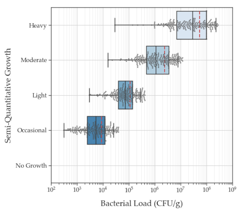
Figure 3.
Box and whisker plot of semi-quantitative and quantitative culture results for each bacterial isolate (n = 941 after outlier rejection). The box lines indicate 25th, 50th (i.e., median, bold text), and 75th percentiles. Quantitative values represent log transformed bacterial loads. Error bars indicate minimum and maximum values. Red dashed lines indicate mean value. Grey dots represent individual data point. Grey vertical lines and black ticks on x-axis denote subdivision units between each major log10 division.

