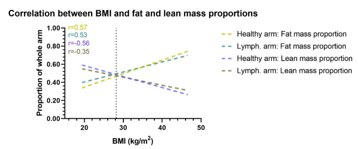
Figure 4.
Correlation between BMI and arm proportion of fat and lean mass. This figure shows the correlation between BMI and the proportional amount of lean and fat mass in the healthy and lymphedema arm. Correlation lines are shown as lines of best fit through a scatterplot. When BMI increases the lymphedema and healthy arms proportion of fat mass increases, while the proportion of lean mass decreases. The vertical dotted line denotes the mean BMI of the cohort. Lymph. = lymphedema. r= Pearson r correlation.

