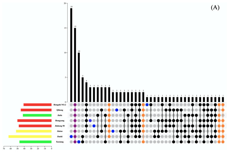
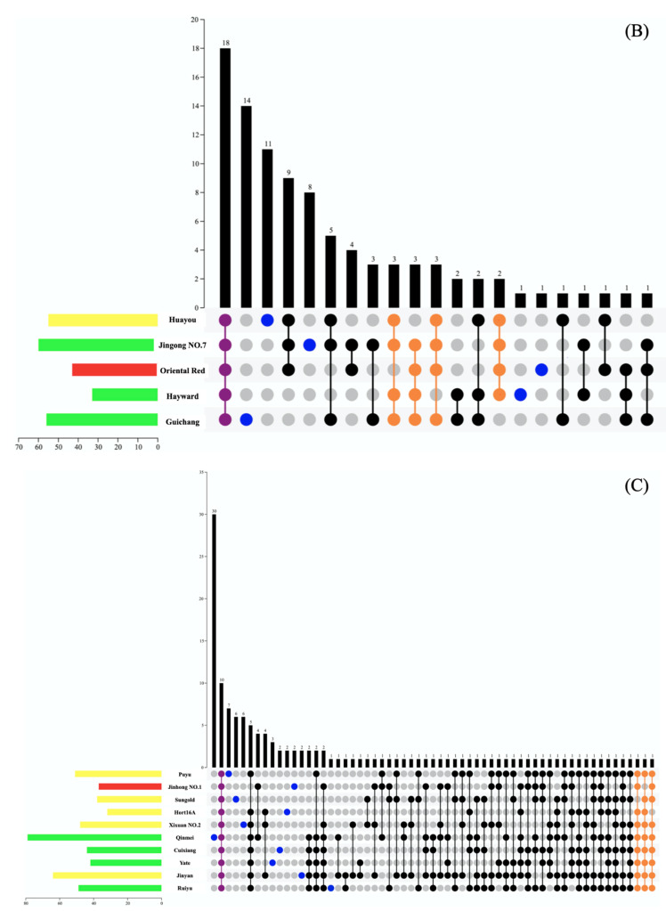
Figure 4.
Venn diagrams for the analysis of volatile components in kiwifruit samples of different types (three major categories (A–C) based on the E-nose response). The length of the histogram on the left represents the number of volatile components in different kiwifruit cultivars, and the color represents the color of the kiwifruit flesh, namely, green-, yellow-, and red-flesh kiwifruit. The dot chart below represents the number of common volatile components in different kiwifruit cultivars.


