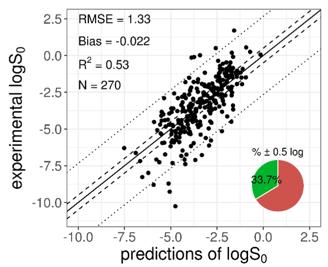
Figure 2.
Plot of the experimental versus predicted logS0 for the 270-compound training dataset. The solid diagonal line represents the identity line; dashed and dotted lines represent the displacement from the identity line by ±0.5 log and by ±2 × RMSE log, respectively. The pie chart refers to the percentage of “correct” predictions (within % ± 0.5 log).

