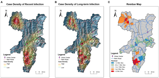
Figure 3.
Difference in geographic distribution patterns of recent and long-term infection cases. Kernel density of recently infected HIV cases (A) and long-term infected HIV cases (B) was calculated and mapped on topographic maps. The value of density is displayed through a gradient colormap and the altitude terrain is shown through shading. Dashed red rings encircle the areas showing obviously higher kernel density of recent infection than long-tern infection. Dashed green rings encircle the areas showing obviously lower kernel density of recent infection than long-tern infection. The statistically calculated residuals from OLSR were mapped to visualize the spatial variation between recent and long-term infection (C). The areas indicated by red and orange have higher kernel density of recent infection, while the areas indicated by blue and green colors have lower kernel density of recent infection. The areas in gray have no difference in kernel density between recent and long-term infection. County borders are indicated by black lines. Town borders are indicated by gray lines, and main roads are indicated by blue lines.

