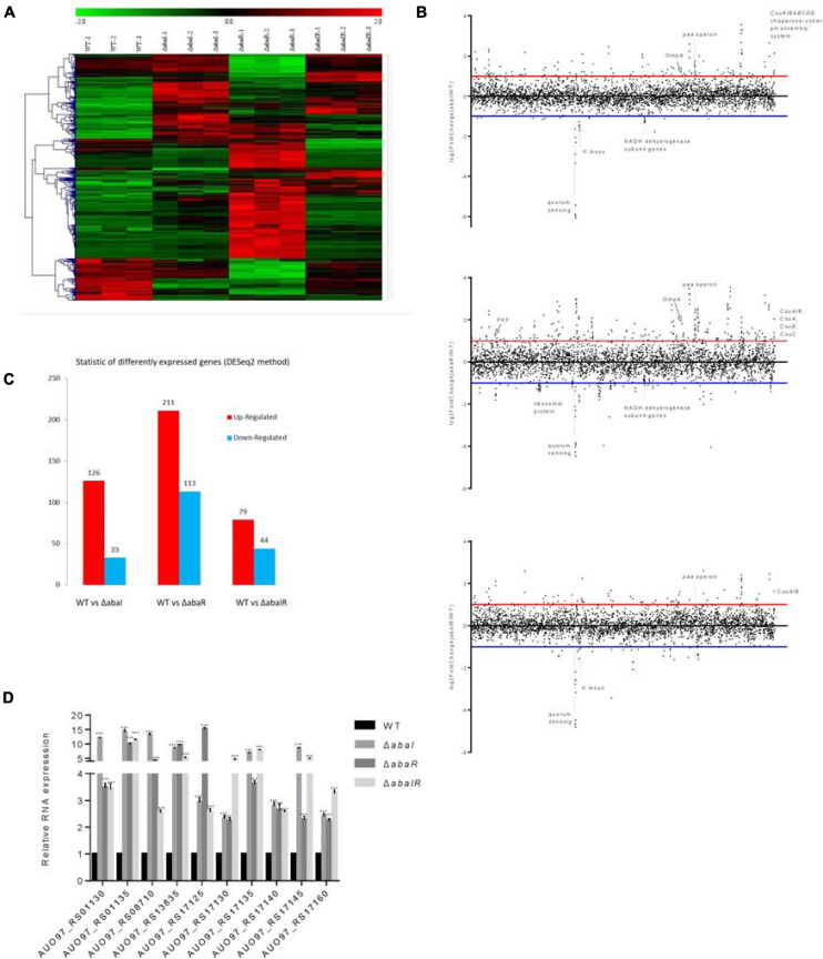
FIGURE 7.
(A) Heat map representation and hierarchical clustering of gene expression changes. The x-coordinate represents the different experimental groups. Data represent differential gene expression profiles (PFKM) for genes listed along the ordinate. Red indicates increased expression, and green indicates decreased expression; color intensity indicates the magnitude of difference in expression according to the horizontal scale at the top. Black depicts genes with no significant difference in expression. (B) The genome-wide transcriptomic profile, genome-wide differential gene expression locus map, and plot of differential gene expression mutant compared with WT with respect to the gene locus tag number. (C) The vertical axis represents the number of significantly DEGs. The log2-fold change in expression for each gene meeting the study threshold (log2-fold change >1, false discovery rate < 0.001). The number of significantly DEGs can be divided into the number of significantly upregulated DEGs and the number of significantly downregulated DEGs. (D) Relative expression of 10 upregulated genes; results are presented relative to WT, which was normalized to 1. The results are expressed as mean ± SEM for at least three biological replicates. ***P < 0.001, t-test.

