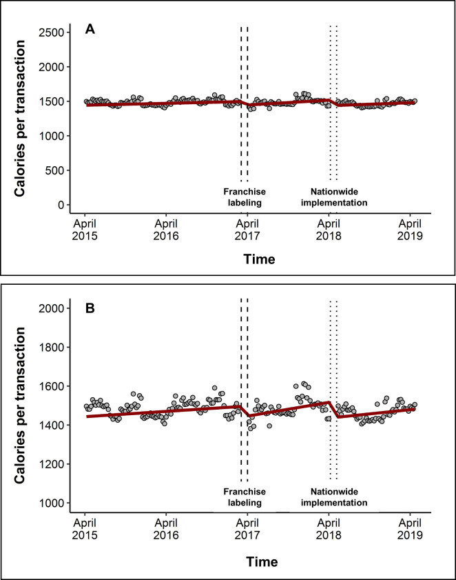
Fig 1. Level and trend changes in mean purchased calories per transaction after franchise labeling and implementation of labeling nationwide.
(A) The graph shows mean calories/transaction across all restaurants (gray dots) and the predicted calories/transaction from the model (red line). The model is also adjusted for seasons and holidays, but these effects are not depicted here. The time surrounding franchise labeling (April 2017) is depicted as dashed vertical lines, and the time surrounding nationwide implementation (May 2018) is depicted as dotted lines. (B) Same as (A) but magnified to see level and trend changes more easily.

