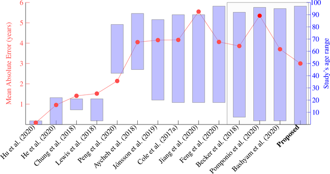
Figure 10:
Accuracy comparison among different studies that used different datasets. Each column is one study. They used different datasets and had different age ranges. Red dots, following the red scale bar on the left, are the Mean Absolution Error (MAE) in each study. Blue bars, following the blue scale bar on the right, are the age ranges in each study. Our proposed study is represented by the blue bar on the most right part of the figure. The gray rectangle box highlights four studies, in the right part of the figure, which used > 6,000 subjects and lifespan data. Therefore, these studies in the gray rectangle box are more comparable, and among them, our study had the lowest MAE.

