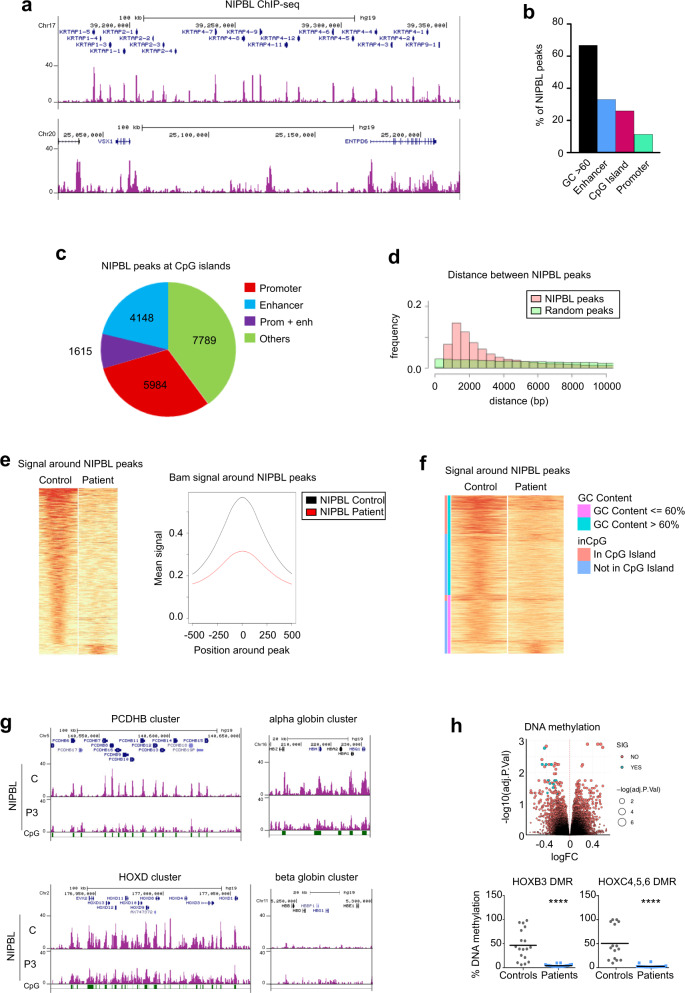
Fig. 4. Genome-wide distribution of NIPBL in CdLS-derived cells.
a Snapshots of the browser showing representatives NIPBL ChIP-seq data in control fibroblasts in two different genomic regions. b NIPBL peaks distribution. Percentages of NIPBL peaks that colocalized with the indicated genomic features (black, GC > 60; blue, enhancer; purple, CpG Island; green, promoters). c Pie charts showing the distribution of NIPBL peaks located at CpG islands in promoters (red), enhancers (blue), or promoters + enhancers (violet) and others (green). d Plot representing the NIPBL peaks distribution with respect to the chromosome distance (pink) compared with random peak distribution (green). e Heatmap (left panel) and plot of mean read density NIPBL signals (right panel) showing a general loss of NIPBL signal around NIPBL peaks in Patient 3-derived cells (red) compared with the control (black). f Heatmap showing NIPBL signal distribution with respect to the DNA GC content and its presence into a CpG island and their corresponding signal in the patient (GC content < = 60%, pink; GC content > 60%, light blue; in CpG island, light red; not in CpG Island, blue). g Snapshots of the NIPBL peaks distribution in control (C) and CdLS Patient 3-derived cells (P3) at four gene clusters. CpG island positions are indicated in green boxes. h DNA methylation in CdLS-derived fibroblasts. (upper panel) Volcano plot representing the DNA methylation changes in control and CdLS-derived fibroblasts (significantly methylated samples are marked in blue and non-significant in red). Validation by bisulfite pyrosequencing was performed at six DMPs for HOXB3 (Control, n = 3, gray; Patients, n = 3, blue) and at five for HOXC4, 5, and 6 (Control, n = 3, gray; Patients, n = 4, blue) from three independent experiments (lower panel). Means were calculated for all the DMPs within a promoter and represented as DMRs. Two-sided unpaired student’s t-test (****p < 0.0001).

