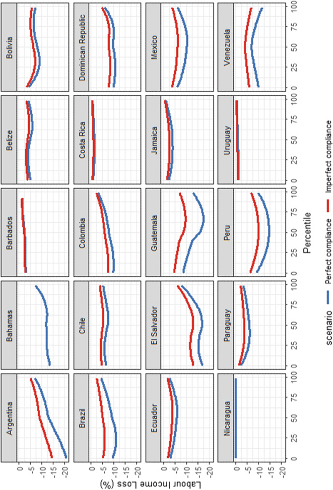
Fig. 6.
Lockdown incidence curves under perfect and imperfect compliance, by country. Source: Harmonised Household Surveys of Latin America and the Caribbean and Oxford Stringency Index and Google Workplace Mobility Data, authors’ own calculations. Notes: The blue curves represent the relative change in the annual labour income distribution assuming perfect compliance, while the red curves represent the relative changes in the annual labour income distribution when allowing for some degree of non-compliance. The LIC curves allow examining which part of the labour income distribution suffers the largest relative labour income losses. A smoother has been applied to the curves

