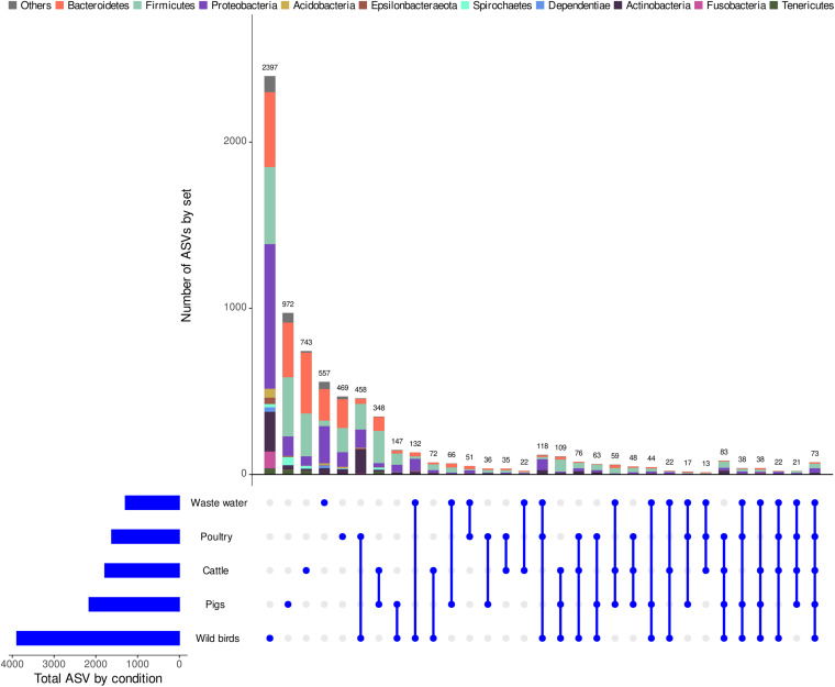
FIGURE 1.
UpSetR visualization of interactions between the obtained ASVs within the whole dataset. The grid along the bottom is used to identify interaction sets (analogous to a Venn diagram). Heavily colored and connected blue dots in the grid indicates that the key group shown on the left has contributed to the interaction set shown on the top. The number of ASVs per group and the size and taxonomy (at the phylum level) of each interaction set are represented by horizontal bars on the left and vertical bars on the figure above, respectively.

