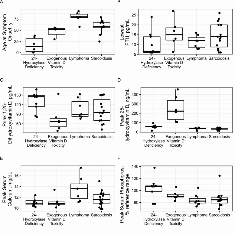
Figure 1.
Boxplots show comparisons across disease groups. The heavy line represents the median, boxes represent the first and third quartiles, and whiskers represent 1.5 × interquartile range values. (A) Age at symptom onset. (B) Lowest parathyroid hormone (PTH). (C) Peak 1,25 dihydroxyvitamin D3. (D) Peak 25-hydroxyvitamin D3. (E) Peak serum calcium. (F) Peak serum phosphorus.

