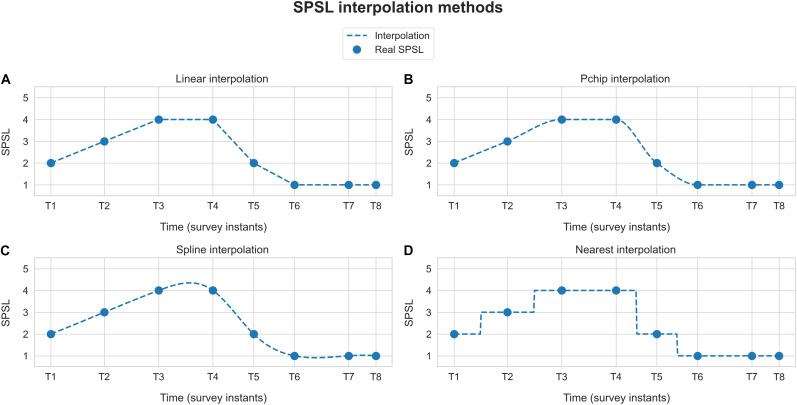
FIGURE 3.
Self-perceived stress level interpolation example. Blue dots represent the responses provided by the participant to the SPSL surveys (T1–T8). Dashed blue line corresponds to the interpolation of the SPSL values. Each graph represents one of the four interpolation schemes applied. (A) Linear interpolation, (B) pchip interpolation, (C) spline interpolation, and (D) nearest interpolation.

