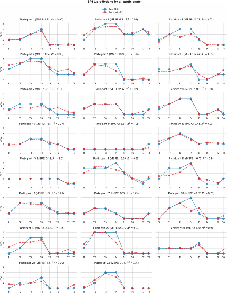
FIGURE 6.
Self-perceived stress level values predicted by the best regression model (random forest with linearly interpolated data) for each participant. Red square markers represent predicted SPSL values in T1–T8. Blue round markers represent SPSL values provided by the participant in T1–T8. MSPE and R2 for each participant are reported in brackets in the graph titles. For simplicity, we have displayed Y-axis only in the first graph of each row, and we have used the same scale for all the participants.

