FIGURE 2.
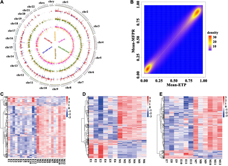
Identification of differentially methylated regions (DMRs). (A) Circos plots of the distribution of the whole-genome DMRs within the 23 chromosomes. From outside to inside, the first circle shows chromosome distribution with numbers representing the parts each chromosome is divided equally, the second shows the DMRs in the ETP female vs. MFPR female groups (EF vs. MF), the third shows the DMRs in the ETP male vs. MFPR male groups (EM vs. MM) and the fourth shows the DMRs in the ETP vs. MFPR groups (E vs. M). Red color indicates higher levels and blue indicates lower levels of methylation in DMRs in the MFPR group than in the ETP female group. Brown color indicates higher levels and green indicates lower levels of methylation in DMRs in the MFPR group than in the ETP male group. Pink color indicates higher levels and yellow indicates lower levels of methylation in DMRs in the MFPR group than in the ETP group. Lines represent the difference in methylation levels between the two groups, and increasing length denotes difference in methylation level. (B) Density plots of genome-wide paired values of fetal tissue DNA methylation. The color represents two-dimensional transformed density (blue = low density, orange = high density). (C–E) Heatmap cluster analysis of DMRs in the whole genome. Each row represents an individual DMR, and each column represents one group. The colors in each block from blue to white to red sequentially represent methylation ratios from –3 to 0 to 3, respectively. (C) Heatmap cluster analysis of DMRs in the whole genome between ETP controls and the MFPR group. (D) Heatmap cluster analysis of DMRs in the whole genome between ETP male controls and the MFPR group. (E) Heatmap cluster analysis of DMRs in the whole genome between AB female controls and the MFPR group.

