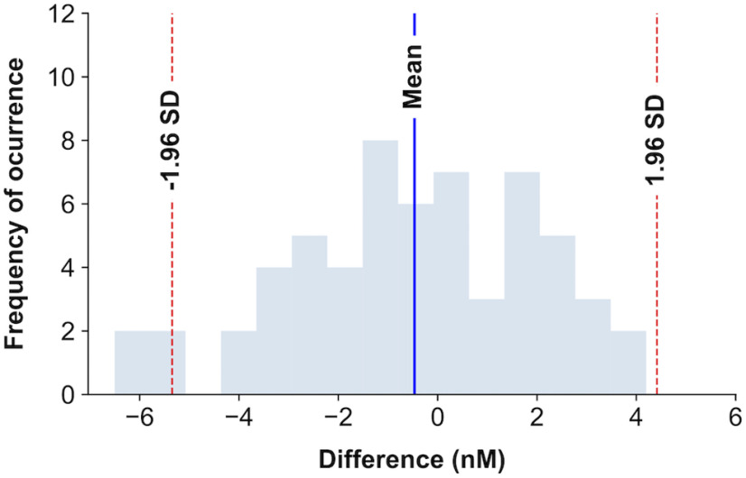
Figure 2.
Histogram of ESCIT and FMH differences in the time series. Representation of the frequency of occurrence of differences between serotonin concentrations followed by FMH or ESCIT administration. The blue shaded bars represent the number of time series encountered within a concentration difference interval. The blue vertical line represents the mean of differences, and the red dashed lines, the 95% confidence interval. We can see that the mean of the differences is close to 0.

