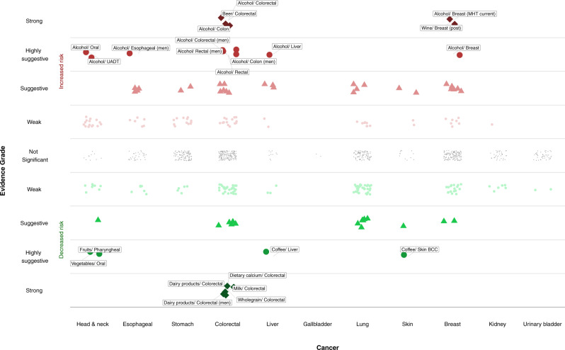
Fig. 1. Scatter plot showing results from the umbrella review grading the evidence on diet and cancer risk.
The Y-axis shows the strength of the evidence. The upper half displays associations that increase cancer risk (in red), whereas the bottom half shows associations that reduce cancer risk (in green). The different point symbols and color intensity represent the different levels of evidence grading. Points colored in gray denote no statistically significant associations. The X-axis corresponds to the different cancer sites. BCC basal cell carcinoma, MHT menopausal hormone therapy, UADT upper aerodigestive tract.

