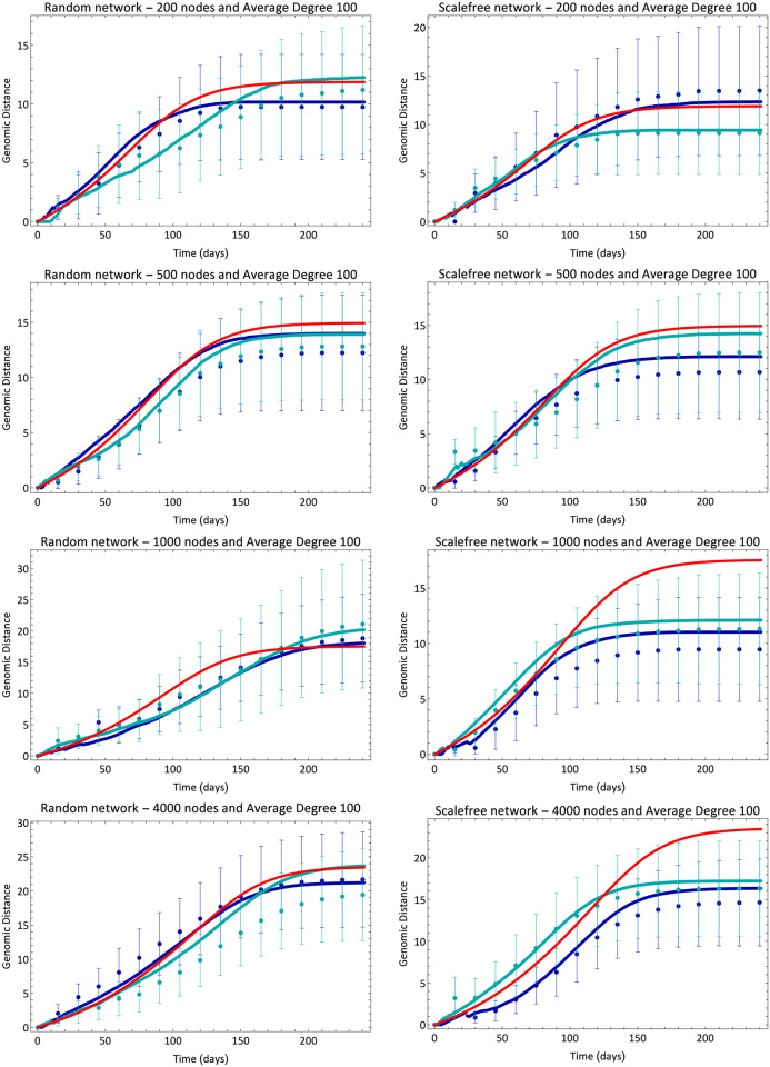
Fig 2. Evolution of average genetic distance.
Blue lines and dots are, respectively, analytical (Eq (2)) and simulation results for different simulations. Different shades of blue correspond to different simulations for the same set of parameters. The red line shows the result of mean-field Eq (3). Error bars are standard deviation of the distance distribution in each simulation at each time.

