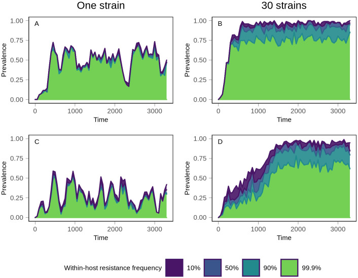
Fig 5. Evolutionary trajectory of resistance.
Following introduction of treatment at time 0, the prevalence of within-host frequencies of resistance was monitored over time. The top (purple) line indicates the prevalence of all treatment-resistant infections, defined as infections consisting of at least 10% resistant parasites. Moving down from the top, the prevalence of infections consisting of between 10% and 50% resistant parasites is shown in blue. Below that, the teal section shows the prevalence of infections in which the frequency of resistant parasites is between 50% and 90%. Finally, the bottom section in green shows the prevalence of infections in which resistance is at near fixation within the host, with a frequency exceeding 99.9%. Top row (A and B): 300 vectors. Bottom row (C and D): 1200 vectors. Left column (A and C): one strain. Right column (B and D): 30 strains. The minimal separation between lines in the one strain conditions demonstrates that mixed infections are rare, compared to 30 strain conditions. Data shows one representative simulation for each condition.

