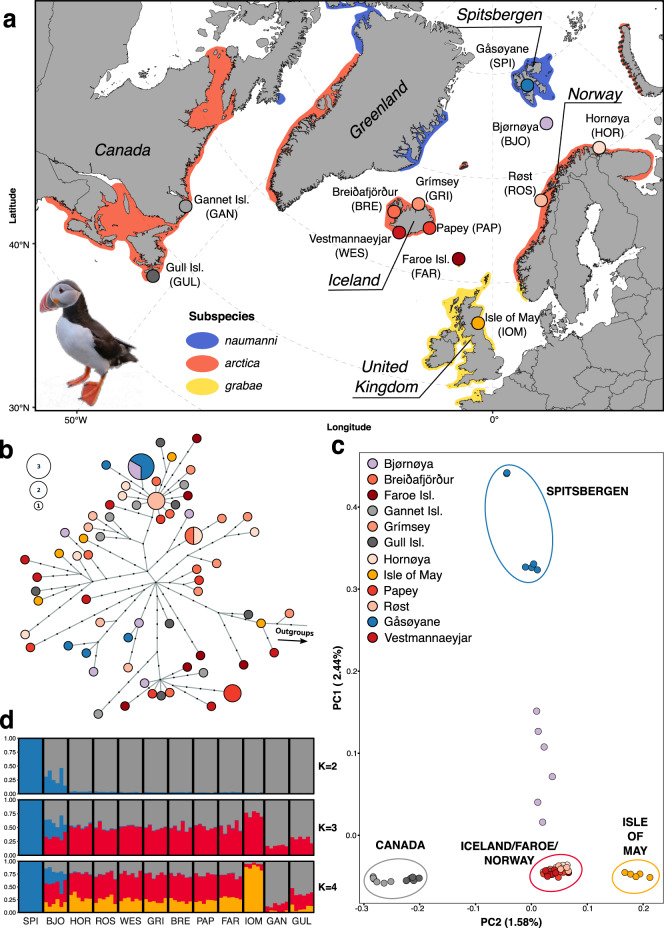
Fig. 1. Sampling distribution and genomic structure of 71 Atlantic puffin individuals across 12 colonies throughout the breeding range.
a Map presenting the location of the 12 sampling sites. Color shading indicates the breeding range of the species as a whole, as well as the recognized subspecies. b Mitochondrial haplotype network based on a maximum likelihood tree generated with IQTree and visualized using Fitchi. It contains 66 unique haplotypes identified by 192 mitogenome-wide SNPs. Sizes of circles are proportional to haplotype abundance. Color legend is provided in (c). Black dots represent inferred haplotypes that were not found in the present sampling. c Principal component analysis (PCA) using genotype likelihoods at 1,093,765 polymorphic nuclear sites calculated in ANGSD to project the 71 individuals onto PC axes 1 and 2. Each circle represents a sample and colors indicate the different colonies. The percentage indicates the proportion of genomic variation explained by each axis. The color coding of the colonies is consistently used throughout the manuscript. d CLUMPAK-averaged admixture plots of the best K’s using the same genotype likelihood panel as in (c). Each column represents a sample and colonies are separated by solid white lines. Optimal K’s were determined by the method of Evanno et al.41 (see Fig. S6a) and colors indicate the ancestry fraction to the different clusters. The dataset(s) needed to create this figure can be found at 10.6084/m9.figshare.14743242.v1.

