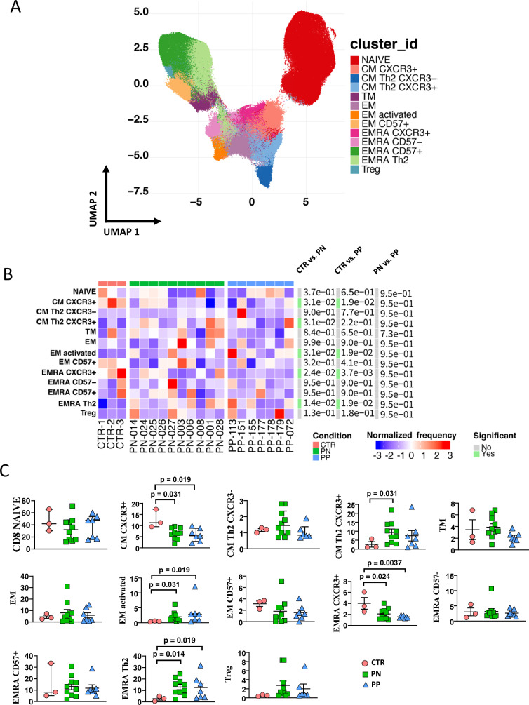
Fig. 4. Reclustering of CD8+ T cells reveals similar distribution of cells between infected or noninfected pregnant women and donors.
A. Left panel: Uniform manifold approximation and projection (UMAP) representation of CD8 T-cell landscape. Each color indicates one of the 13 different clusters. CM central memory, TM transitional memory, EM effector memory, EMRA terminally differentiated T cells, TREG regulatory T cells. B Differential analysis performed using generalized linear mixed model (GLMM) between nonpregnant women (CTR; bar color: salmon; n = 3), uninfected pregnant women (PN; green, n = 10), and infected pregnant women (PP; azure, n = 7). The heat represents arcsine-square-root-transformed cell frequencies that were subsequently normalized per cluster (rows) to mean of zero and standard deviation of one. The color of the heat varies from blue indicating relative underrepresentation to red indicating relative overrepresentation. Bar and numbers at the right indicate significant differentially abundant clusters (green) and adjusted p values. C Statistical analysis of the different cell populations identified as in panel A. Comparison among infected pregnant women (PP) vs. uninfected pregnant (PN) or vs. healthy, nonpregnant donors (CTR). The dot plots show the relative abundancies of 13 populations found within CD8+ T cells. Values (dots) for the three conditions are matched with the color used in B. Data represent individual percentage values (dots), median (center bar), and SEM (upper and lower bars). Generalized linear mixed model (GLMM) with Bonferroni correction has been used. The exact p-value is indicated in the figure. Source data are provided as a Source Data file.

