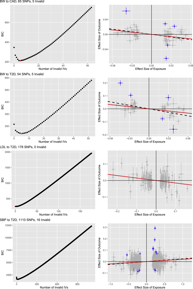
Figure 10.
BIC and scatter plots for four pairs
For four risk factor-disease pairs, the left panels show the numbers of invalid IVs versus BIC values, while the right panels show versus (with their errors bars indicating and ). In the right panels, those for invalid IVs detected by BIC are blue, the red solid lines give the causal estimates (after removing the detected invalid IVs), and the black dashed lines are for the estimates based on all IVs.

