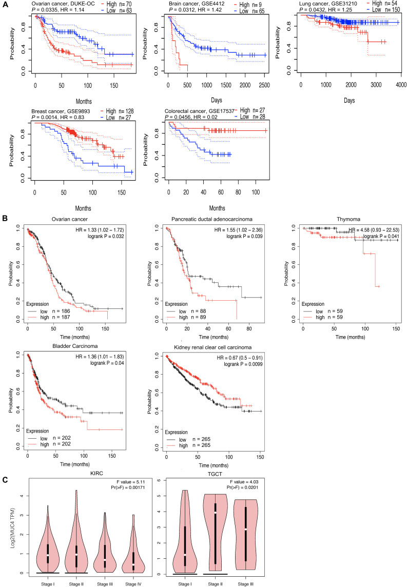
FIGURE 2.
Overall survival curves comparing the high and low expression of MUC4 and pathological stage plot across different cancer types. (A,B) Kaplan–Meier plot in PrognoScan panel (A) and Kaplan–Meier Plotter panel (B). The X-axis represents time, and the Y-axis represents survival rate. Ninety-five percent confidence intervals for each group are also indicated by dotted lines from PrognoScan. (C) Expression violin plot based on patient pathological stage in GEPIA2. HR, hazard ratio.

