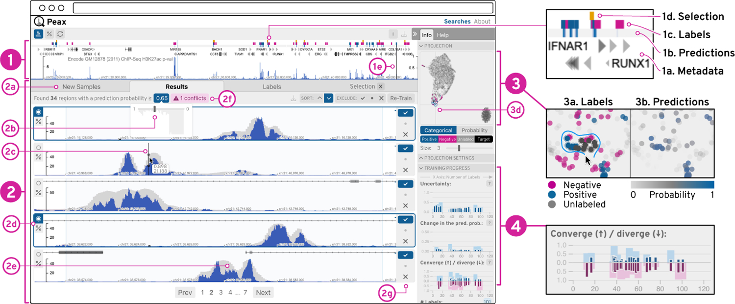
Figure 5: User Interface.

The sequential data is visualized as blue bar charts (1&2), which can be superimposed with the CAE’s reconstruction as gray bars (2e). Additionally, the query view (1) can show metadata (1a-d) as region-based annotations. The list view (2) shows windows for comparison and labeling. The embedding view (3) represents windows as dots on a 2D canvas. The progress view (4) visualizes training metrics of the classifiers as composed bar charts (4), where the dark and light bars are relative to the labeled and all windows respectively.
