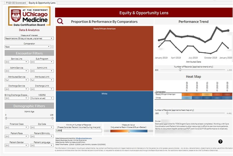
Figure 1.
Equity lens. The left side of the dashboard provides users the options to choose a measure of interest, a sociodemographic variable on which to stratify performance of the selected measure, and various encounter and demographic filters to further refine the population for analysis. The left-most visual represents the various comparator groups. The size of the box represents number of patients and color indicates performance on the measure, with red representing worse performance and blue representing better performance. The far-right visuals provide historical performance month-by-month (top) and quarter-by-quarter (bottom). The image details an example of how 30-day all-cause unplanned readmission rates can be analyzed by race. Portions of the image were blurred intentionally for publication.

