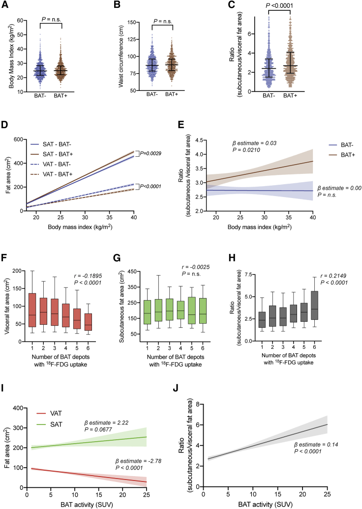
Figure 3.
BAT status and activity are associated with body fat distribution
(A) Distribution of BMI by BAT status. Lines represent the 10th percentile, median, and 90th percentile. The p value was calculated based on a Mann-Whitney U test.
(B) Distribution of waist circumference on CT by BAT status. Lines represent the 10th percentile, median, and 90th percentile. The p value was calculated based on a Mann-Whitney U test.
(C) Distribution of SAT:VAT ratio by BAT status. Lines represent the 10th percentile, median, and 90th percentile. The p value was calculated based on a Mann-Whitney U test. The depicted data show measurements for 1,662 individuals.
(D) Best fit curves representing the relationship between BMI and SAT area (solid lines) or VAT area (dashed lines), stratified by BAT status, were calculated using linear regression analysis. The shaded areas represent the 95% CIs. The p values were calculated for assessing statistically significant differences between the slopes of these two lines. Best fit curves are shown up to a BMI of 40 kg/m2.
(E) Best fit curves representing the relationship between BMI and SAT:VAT ratio, stratified by BAT status, were calculated using linear regression analysis. The shaded areas represent the 95% CIs. β-Estimates and p values correspond to the linear regression model. Best fit curves are shown up to a BMI of 40 kg/m2.
(F) Boxplot of the total VAT area against the number of active BAT depots. Boxes represent the 25th percentile, median, and 75th percentile, and whiskers illustrate the 10th and 90th percentiles. Correlations were assessed by calculating Spearman’s rank correlation coefficient.
(G) Boxplot of the total SAT area against the number of active BAT depots. Boxes represent the 25th percentile, median, and 75th percentile, and whiskers illustrate the 10th and 90th percentiles. Correlations were assessed by calculating Spearman’s rank correlation coefficient.
(H) Boxplot of the SAT:VAT ratio against the number of active BAT depots. Boxes represent the 25th percentile, median, and 75th percentile, and whiskers illustrate the 10th and 90th percentiles. Correlations were assessed by calculating Spearman’s rank correlation coefficient.
(I) Best fit curves of SAT and VAT areas as a function of BAT activity on PET/CT were calculated using linear regression analysis. The shaded areas represent the 95% CIs. β-Estimates and p values correspond to the linear regression model. Data are shown up to a BAT activity of 25 SUVs.
(J) Best fit curve of SAT:VAT ratio as a function of BAT activity on PET/CT was calculated using linear regression analysis. The shaded areas represent the 95% CIs. β-Estimate and p value correspond to the linear regression model. Data are shown up to a BAT activity of 25 SUVs.
For (A) and (B), data are shown for measurements of 1,702 individuals. For (D) and (E), fitted curves were derived from measurements of 1,702 individuals. For (F)–(H), data are shown for measurements of 856 patients. For (I) and (J), fitted curves are derived from measurements of 856 individuals.

