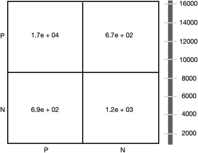
Fig. 4.

Confusion Matrix - P and N represent positive and negative COVID cases. The x-axis shows several actual cases, and the y-axis shows several predicted cases. The bar on the right side represents the number of cases. Each column value is a rounded figure.
