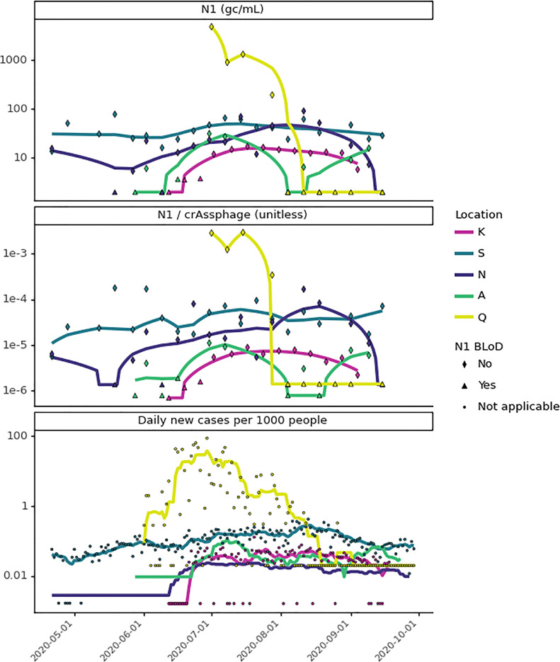
Fig. 5.
Comparison of wastewater SARS-CoV-2 N1 to geocoded COVID-19 clinical testing results from May to September 2020. Wastewater SARS-CoV-2 N1 signal is compared as unnormalized (top) and crAssphage-normalized (middle), where lines are the most optimal Lowess trendlines. COVID-19 clinical testing results are the daily per capita COVID-19 cases, where lines are the fourteen-day moving average (location N) or seven-day moving averages (all other locations) (bottom). Heatmap visualization of the unnormalized N1 trendlines is included in the SI (Figs. S6 and S7) and visualization of sewersheds by location can be found in Fig. S12.

