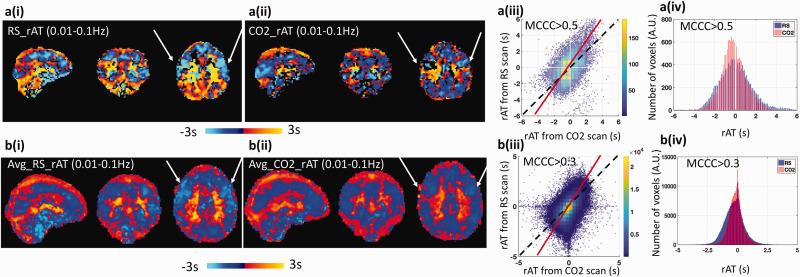
Figure 3.
Comparison of the relative arrival time (rAT) map obtained from resting state fMRI (RS-fMRI) data and the CO2 challenge fMRI data. Top panel (a) present the results obtained from a single subject, while bottom panel (b) are the results averaged over 8 subjects. (i) rAT maps derived from RS-fMRI. (ii) rAT maps derived from the CO2 challenge data. (iii) Scatter plots comparing rAT values obtained from RS-fMRI and the CO2 challenge data. The dashed lines represent a slope of 1 (i.e., the same rAT values in each voxel obtained from RS-fMRI and the CO2 challenge data), while the solid red lines represent the fitted dominant axis of the correlation. The steeper red lines indicate that the blood generally travels faster under CO2 challenge than in RS. (iv) Comparison of the distribution of rAT values obtained from RS-fMRI and the CO2 challenge data. Note that the width (measured by the full-width at half maximum) in the CO2 challenge data is smaller than that observed for the RS-fMRI data. The threshold of the maximum cross-correlation coefficient (MCCC) for graphs a(iii) and a(iv) was 0.5, while the threshold for graphs b(iii) and b(iv) was 0.3.

