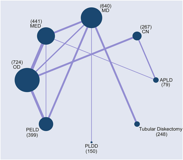
Figure 2.
Network plots of comparisons based on network meta-analysis (NMA). Each circular node represented a type of treatment. The circle size is proportional to the total number of patients. The width of lines was proportional to the number of studies performing head-to-head comparisons in the same study.

