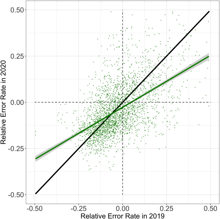
Fig 4. Relative error rate in 2020 as a function of relative error rate in 2019.
Each data point corresponds to a student, showing their average relative error rate in 2019 (abscissa) and 2020 (ordinate). The green line corresponds to a linear regression fitted to the data. Grey shades indicate the standard error of the mean across students. The black line depicts the identify function (intercept of 0 with a slope of 1) for reference. The intercept of the regression (green) is below zero, indicating that the relative error rate of students decreased from 2019 to 2020. The slope of the regression is below 1, indicating that students categorized as low-performing in 2019 showed greater decrements in relative error rate than students categorized as high-performing (cf. Fig 2), suggesting a narrowing performance gap between students.

