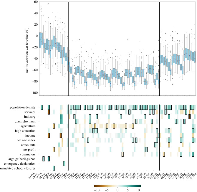
Figure 2.
Province-level mobility reductions and their socio-economic determinants. Top panels show the relative reductions in the mean radius of gyration with respect to the baseline during the whole timeline of the dataset. Boxplots describe the distributions of the reductions by province. Bottom panels show the results of the regression model, displaying the socio-economic variables that are selected by the model to predict the corresponding variations in mobility, on each day. Coloured boxes correspond to those covariates that are selected by the model, and the colour codes the associated coefficient in the regression, from negative (brown) to positive (blue). Black solid squares highlight the covariates that are statistically significant at p < 0.05. Black vertical lines highlight the starting and the ending of the lockdown period.

