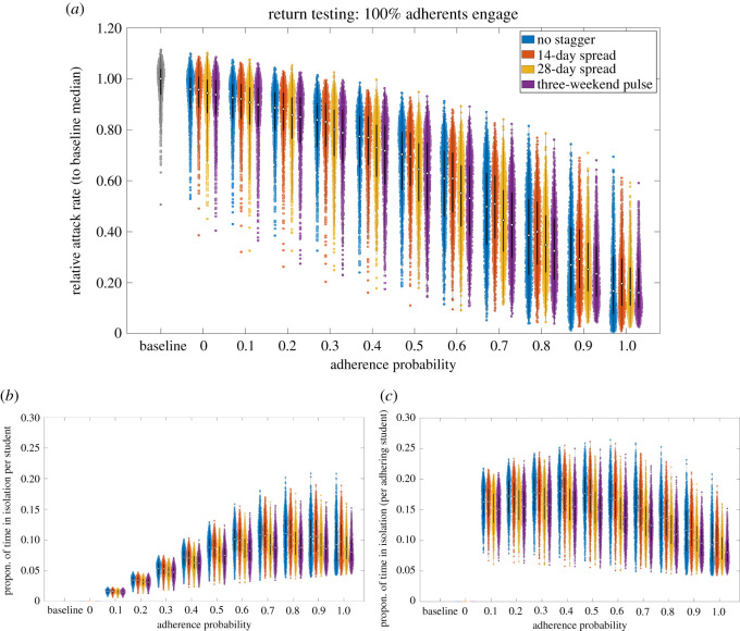
Figure 14.
Epidemiological outcomes among a student population given differing staggered return strategies to university. Outputs summarized from 1000 simulations (with 20 runs per network, for 50 network realizations) for various levels of adherence to NPIs. We considered four strategies: no stagger (blue violin plots); return spread over 14 days (orange violin plots); return spread over 28 days (yellow violin plots); three-weekend pulsed return (purple violin plots). We assumed 100% of adherents engage with return testing. We display distributions corresponding to: (a) relative attack rate, compared with the baseline scenario; (b) time spent in isolation per student; (c) time spent in isolation per adherent student. The white markers denote medians and solid black lines span the 25th to 75th percentiles.

