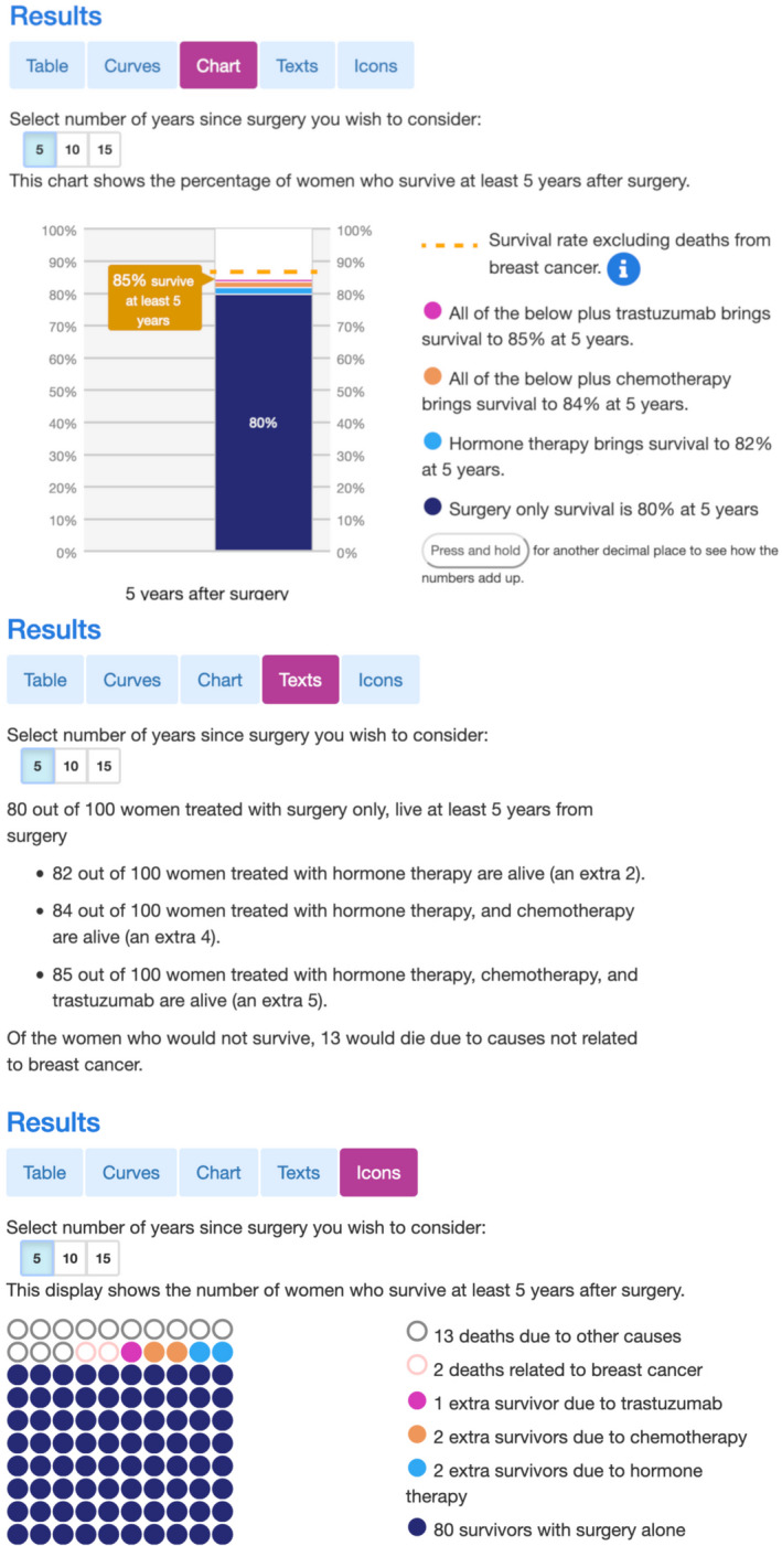
FIGURE 3.

Three different display options for the new Predict: Breast Cancer website. The top panel shows a stacked bar chart, the middle panel a text representation of the same results and the bottom panel shows an icon array. Users can choose of which these displays they want to use to see the results. The two other display options are shown in Figure 2
