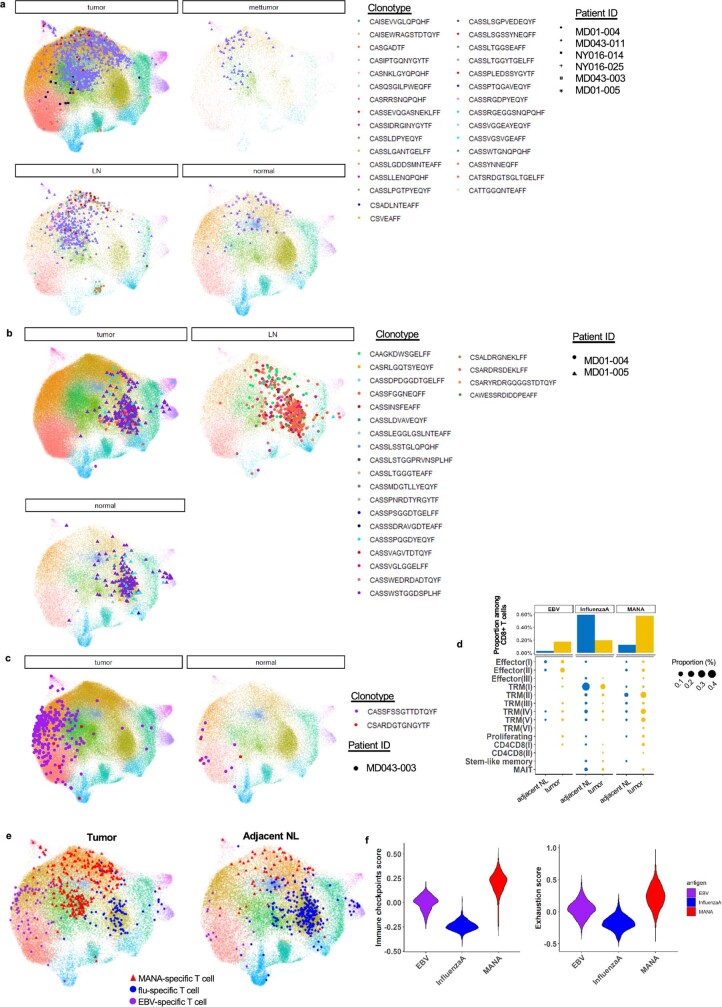
Extended Data Fig. 6. Distinct phenotype of antigen-specific T cells.
a, Distribution of MANA-specific T cells on UMAP. Individual MANA-specific clonotypes are shown on the UMAP, stratified by tissue compartment and patient ID. Each colour represents a unique MANA-specific clonotype, and each symbol represents a patient. b, Distribution of EBV-specific T cells on UMAP. Individual EBV-specific clonotypes are shown on the UMAP, stratified by tissue compartment. Each colour represents a unique EBV-specific clonotype and each symbol represents a patient. c, Distribution of influenza-specific T cells on UMAP. Individual influenza-specific clonotypes are shown on the UMAP, stratified by tissue compartment and patient ID. Each colour represents a unique influenza-specific clonotype, and each symbol represents a patient. The CD8 T cell clusters are annotated according to the designation in Fig. 2b. d, The barplot (upper) shows the proportion of antigen-specific T cells among total CD8 T cells by tissue compartment (blue bar, adjacent NL; yellow bar, tumour). The dotplot (bottom) shows the proportion of antigen-specific T cells stratified by subset, with the size of the dot representing the proportion among total CD8 T cells (blue dot, adjacent NL; yellow dot, tumour). e, TIL and adjacent NL CD8 T cells were downsampled to equal numbers of cells on UMAP before visualization of antigen-specific clonotypes in tumour (left) and adjacent normal lung (right). f, The immune checkpoint score and exhaustion score of antigen-specific T cells. A violin plot shows a composite immune checkpoint score (left) and exhaustion score (right) for EBV(purple)-, influenza (blue)-, and MANA (red)-specific T cells.

