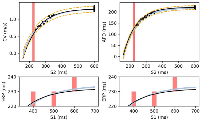
Figure 8.
The RCE prediction from maximum a posteriori (MAP) parameter estimates given noisy measurements for (left) CV(S2) and ERP(S1), (right) APD(S2) and ERP(S1), shown as light shaded regions representing RCE 95% confidence intervals. The orange dashed curves show these intervals including the observation error, also learned from MAP fitting. The noisy S2 restitution data are shown as crosses, while the red shaded bars represent observed intervals containing ERP: (top): bars horizontally span ERP(S1:600) interval; (bottom) bars vertically span ERP(S1) interval for several S1. The solid black lines in all plots represent the corresponding ground truth curves.

