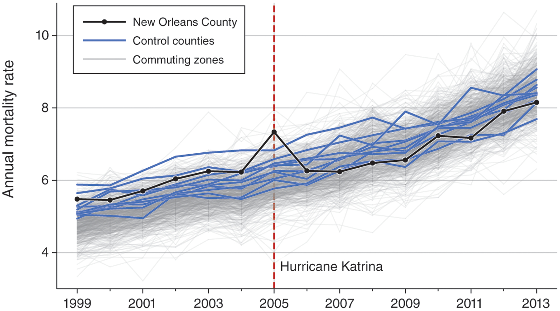
Figure 1.

Cohort Annual Mortality Rates for New Orleans versus Other Areas
Notes: The figure shows raw annual death rates for the 1999 Medicare cohort, by initial region of residence. Mortality rates for the New Orleans county cohort are plotted in black, and mortality rates for the ten control county cohorts are plotted in blue. The light gray lines plot mortality rates for each US commuting zone cohort with at least 1,000 beneficiaries, except for the New Orleans commuting zone.
