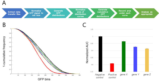
Figure 3. Representative results.
A. Visualization of the data analysis workflow. B. Inverted cumulative GFP distribution plot [Gene X (green), Gene Y (blue), Gene Z (gold), negative control (black; shRNA targeting the white gene, a well-characterized gene known to have no viability effect in these cells) and positive control (red; shRNA targeting the thread gene, an apoptosis inhibitor which robustly induces cell death when inhibited)]. C. Bar graph of area under curve. Error bars represent SEM for 3 replicate wells of each target gene, and 4 replicate wells of each control in a single 96-well plate. In this case, areas have been normalized to the negative control sample.

