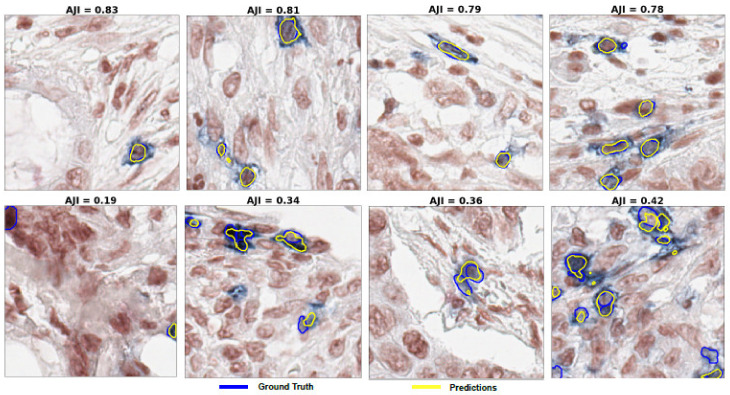
Figure 8.
Examples of some segmentation results of the optimized U-Net model using the test data set. (Upper row): the best performance of the model. (Lower row): the poor performance of the model. Note that, the blue and yellow colours represent the annotated ground-truth and the best model predictions, respectively.

