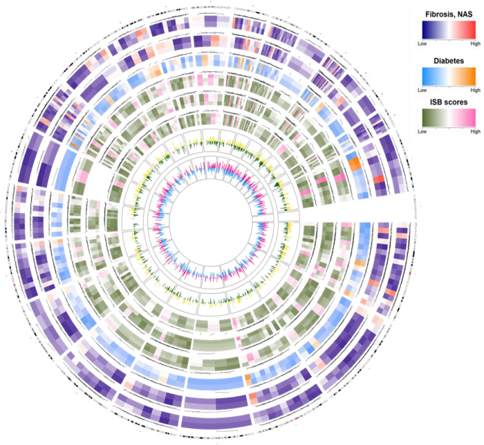
Fig 3. Circos plot presenting the summary of miRNA expression and correlation patterns in 41 patients.
The Circos plot consists of eight tracks, containing six heatmaps for six variables (fibrosis, nonalcoholic fatty liver disease, diabetes, inflammation score, steatosis score, and ballooning score); the two peaks indicate the correlations between miRNAs and two clinical parameters (ALT, alanine aminotransferase; PLT, platelet). The six variables are represented by colors according to high (red, orange, and pink) or low (blue, sky blue, and green) expression. Three variables (inflammation score, steatosis score, and ballooning score) are represented as I, S, and B in the color key. Each variable was grouped into two or three categories of low or high scores or values (fibrosis stage, 0–2 versus 3 and 4; NAS < 5 versus ≥ 5; diabetics, yes versus no; inflammation score 1 versus 2 versus 3; steatosis score 1 versus 2 versus 3; ballooning score 0 versus 1 versus 2). Differences between the mean values of each dataset for the six variables were obtained. Differences in the mean values for each dataset were obtained from the expression levels of 2,576 miRNAs, and the top 200 miRNAs were plotted in the heatmap of the Circos plot. The positioning of each heatmap represents the genomic location of the miRNA, and the color represents the average expression level in patients belonging to each score of each variable. The outer yellow or red indicates a positive correlation between ALT or PLT and miRNA expression, and the inner green or sky blue indicates a negative correlation.

