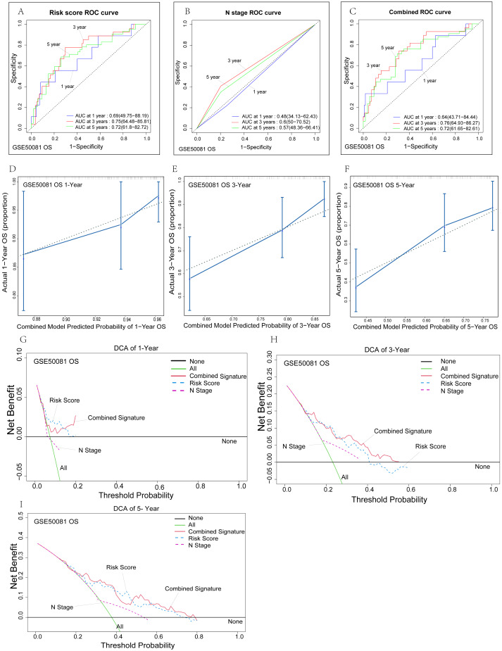
Figure 5. Verification of the risk signature.
(A–C) Time-dependent ROC curves of the nomogram of 1-, 3- and 5-year overall survival for univariate model and combined model to evaluate the predictive performance of the nomogram. The horizontal axis represents the sensitivity of nomogram prediction, and the vertical axis represents the specificity of nomogram prediction. The higher the sensitivity and specificity of nomogram curve, the stronger the prediction power. (D–F) The calibration plot for internal validation of the nomogram. The solid line represents the prediction ability of the model. The closer the solid line is to the dotted line, the closer the prediction of the model is to the real situation. (G-I) DCA curves of the univariate model and combined model for 1-,3- and 5-year overall survival in LUAD to evaluate the clinical decision-making benefts. The horizontal axis represents the threshold probability and the vertical axis represents the net gain. The higher the net gain under the same threshold probability, the stronger the Nomogram prediction power will be.

