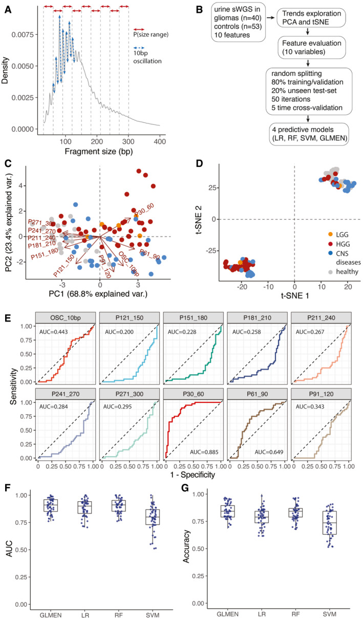
Schematic of the features extracted from the global cfDNA fragmentation patterns of urine samples. 10 features were calculated from the cfDNA fragments size (the proportion of fragments in specific size ranges: P30_60, P61_90, P91_120, P121_150, P151_180, P181_210, P211_240, P241_270, P271_300; and the amplitude of the 10bp oscillations: OSC_10bp).
Workflow for the predictive analysis combining the urine fragment size features via LR, RF, SVM, and GLMEN models. sWGS data from 40 urine samples from patients with gliomas and 53 urine samples from controls were split into five subsets for training/validation (80% of the samples) and testing (20% of the samples), according to a 5‐fold cross‐validation approach and 50 random iterations (see Materials and Methods).
Principal component analysis comparing cancer (HGG and LGG) and control samples (healthy and other CNS diseases) using data from the urine fragmentation features. Red arrows indicate features tested during the predictive analysis.
tSNE analysis comparing cancer and control samples using data from the same urine fragmentation features.
ROC curves for binary classification of cancer and controls for each of the individual fragmentation features analyzed. AUC values are added to the plots.
AUC distribution for the unseen test set (samples from patients with gliomas, 40; controls, 53) for four predictive models (LR, GLMEN, RF, and SVM) trained and optimized following the scheme described in (B) and the Materials and Methods section. For each, models are shown the AUC for the 50 iterations. Horizontal line within the bars represent median of the underlying population. Boxplot whiskers show 1.5 interquartile range of highest and lowest quartile.
Accuracy were compared for the four classifiers and 50 iterations on the unseen test set of baseline and follow‐up samples (19 samples). Horizontal line within the bars represents median of the underlying population. Boxplot whiskers show 1.5 interquartile range of highest and lowest quartile.

