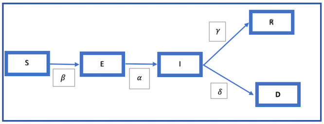
Fig 3. The SEIRD model flow chart.

Legend: This model shows how, beginning from S, the susceptible population moves from being exposed E, to infected I, and then to either recovery R, or death D, the movement being regulated by different parameters.

Legend: This model shows how, beginning from S, the susceptible population moves from being exposed E, to infected I, and then to either recovery R, or death D, the movement being regulated by different parameters.