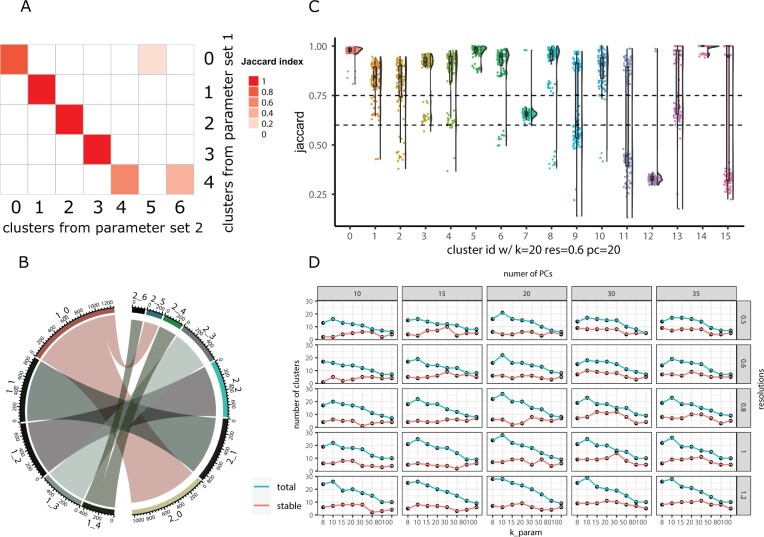
Fig. 1.
Visualizations methods from the scclusteval R package. (A) A pairwise Jaccard index heatmap to visualize the clusters’ relationship between two sets of different clustering parameters for the full dataset. X-axis represents the clusters from parameter set 2, y-axis represents the clusters from parameter set 1. In this example, cluster 0 in the y-axis split into cluster 0 and 5 in the x-axis; cluster 4 in the y-axis split into cluster 4 and 6 in the x-axis. (B) A cluster chord diagram showing cell identity switching between two different clustering parameters with additional information of the cluster size compared to (A). (C) A Jaccard Raincloud plot showing the stability of each cluster. A boxplot with a half-side violin plot showing the distribution of the Jaccard indices (highest Jaccard index used for matching clusters for each subsample) before and after re-clustering across 100 subsamples. The dotted lines are Jaccard cutoffs of 0.6 and 0.75. (D) A line plot showing the relationship between different parameters, and the total number of clusters (blue line) and number of stable clusters (red line). The x-axis represents the k parameter, the y-axis represents the number of clusters. The columns are split by the number of PCs and rows are split by different resolutions.

