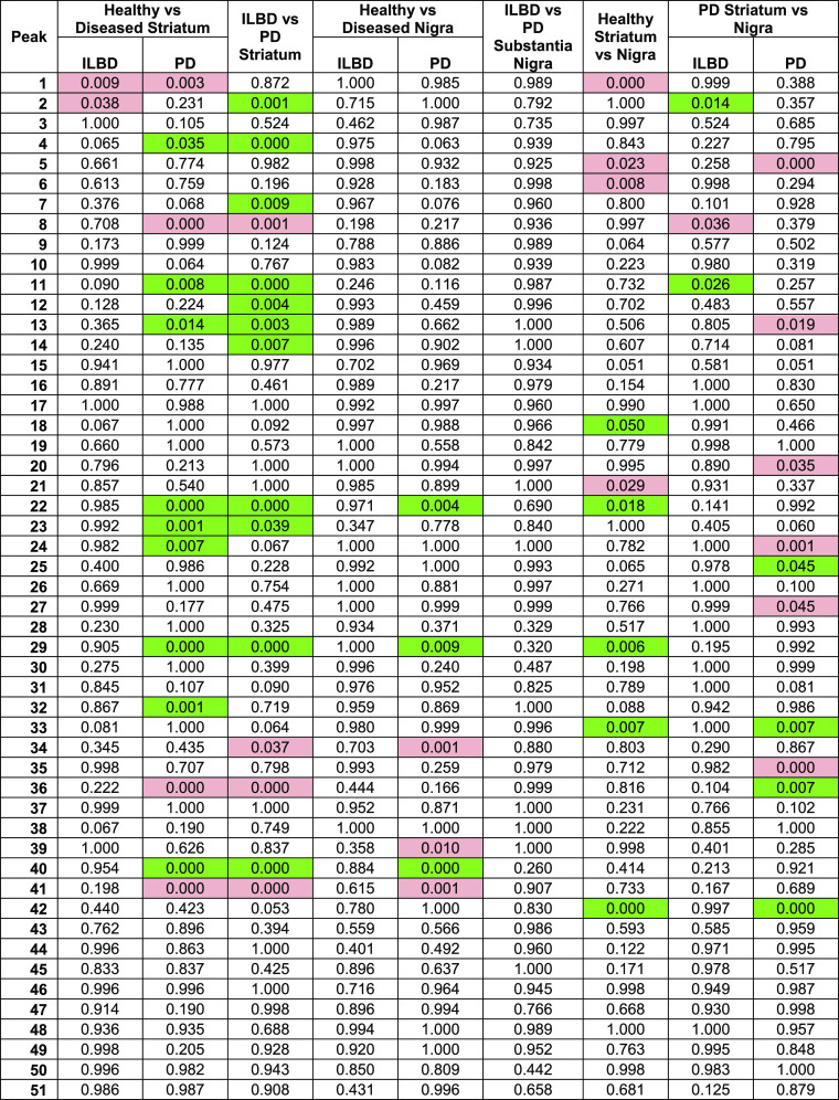
Table 1. p-Values Derived from Comparison of Each Peak across Different Groups Comparing Disease Statesa.
Red indicates a decrease in relative abundance in the leading group (e.g., the healthy group in healthy vs PD), and green indicates an increase—only statistically significant areas highlighted.

